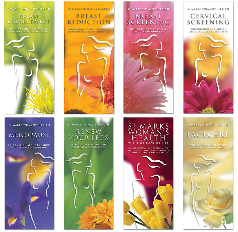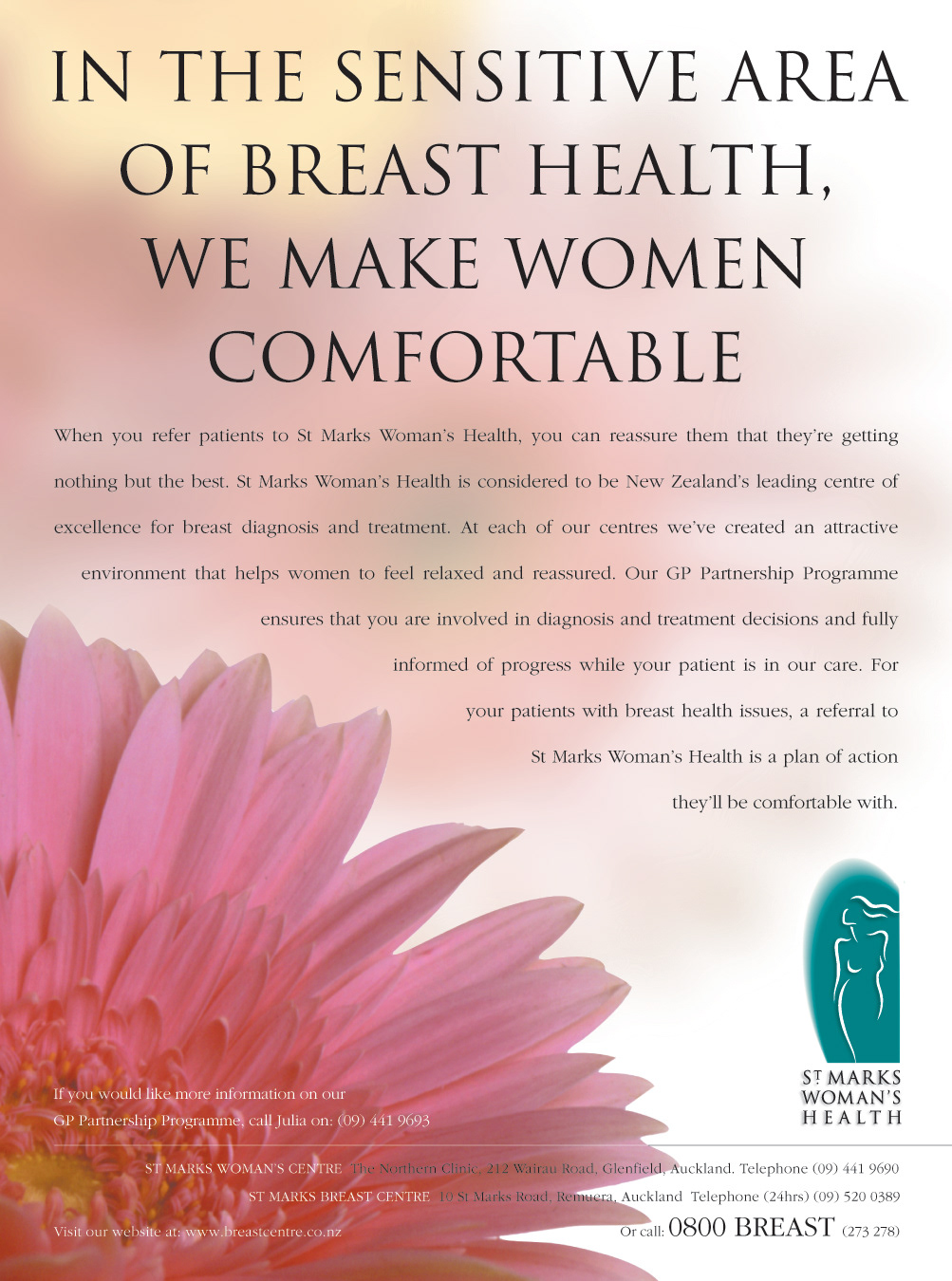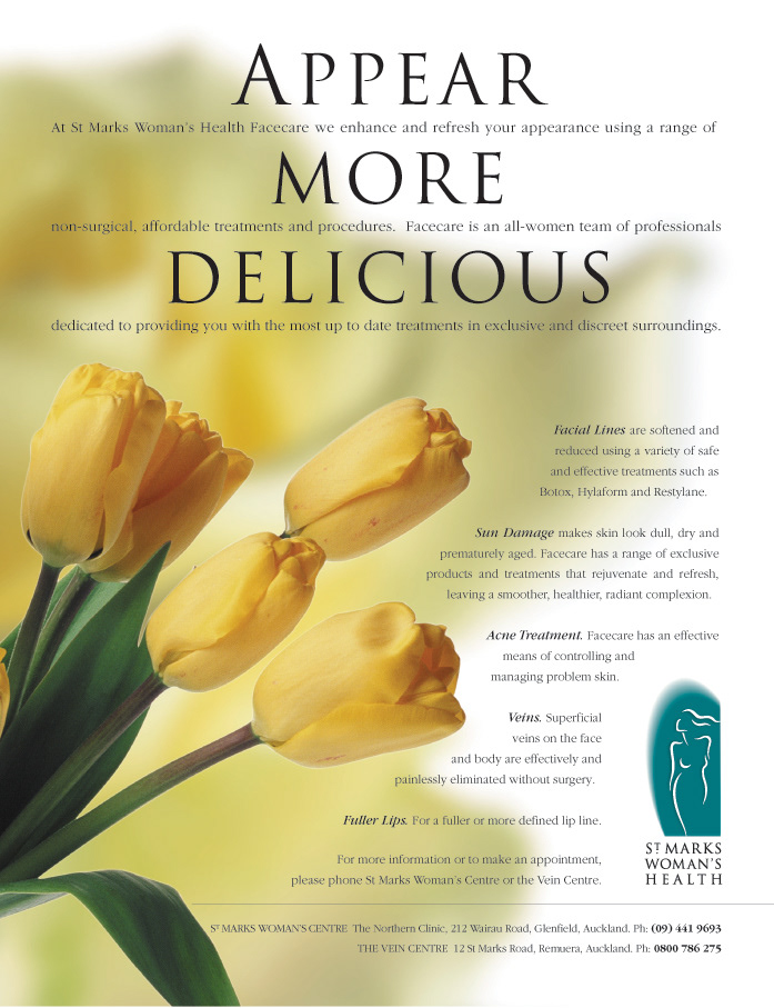
Due to the sensitive nature of many St Marks procedures, many people were reluctant to leave them lying around. This was an impediment to patient information and family discussion. We created an entire brand identity and communications around a metaphor for all things 'feminine'. Beginning with the logo, which was recrafted and 'softened'...

The entire range of imformational brochures was redesigned and new ads were created to appear in womens magazines.